3D Touch & iOS 9
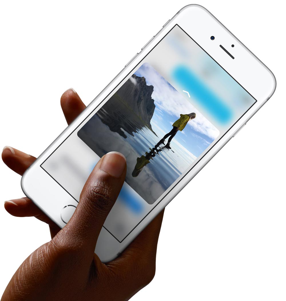
An entire new level of interaction was introduced starting with the iPhone 6s and iOS 9. Using force, a user can access new functionality, peek into their content, and interact with the UI in a whole new way.
An entire new level of interaction was introduced starting with the iPhone 6s and iOS 9. Using force, a user can access new functionality, peek into their content, and interact with the UI in a whole new way.
An entire new level of interaction was introduced with the new iPhone 6s. Using pressure, a user can access new functionality, peek into their content, and interact with the UI in a whole new way.

I began working on 3D touch from day one with a very small group of people. Our team was expected to explore every possible way to bring a new level of vitality to iOS. When curating these ideas, we had to make sure they worked consistently across the entire UI. These features needed to be deeply ingrained in the UI, while also leaving room for developers to get creative with 3D touch.
Below are some select experiments I created when working on this project.
I loved the idea of using pressure to dynamically affect the springboard. One experiment was for rearranging icons or revealing widgets. During the interaction the surrounding icons would all be affected, bringing new life into a static grid of icons.
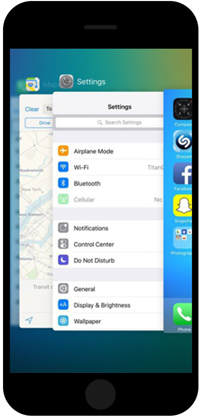
I also explored using 3D Touch to segment controls, and provide new pathways into multitasking by using force to pop into different levels.
Editing text on early iOS versions was still a bit of a pain. I explored ways to lock onto words when scrubbing, and manually expand the selection, or lock into the whole sentence or paragraph by simply adding pressure. I expanded on this even further by revealing shortcuts, or automatically activating the copy/paste feature when full pressure was added.
Another interaction model we explored was peeking into content. This could be useful when there was a link, thumbnail, or abridged list – like the message list in the mail app. Pressure could then be used to peek into the detailed content, release to quickly return, or apply more pressure to pop the content into full view.
Since this required two sequential interactions all done on one axis, we had to fine tune the resistance points, and provide visual feedback throughout. It was interesting to work on this feature both before we had any hardware prototypes, and then refining them once we had usable testing devices.
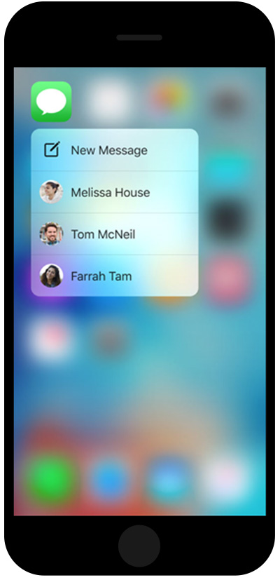
We ultimately used 3D Touch to peek into content and provide quick actions from the springboard. Since the interaction response was completely driven by animation, motion affordances were needed to inform users of the many new ways they can interact with iOS. We defined resistance points for the peek and pop across every app, and single resistance points like the quick actions.
It was exciting to work on such a cutting edge interaction model and figure out how to take mobile interactions beyond just taps, pinches, and swipes.


