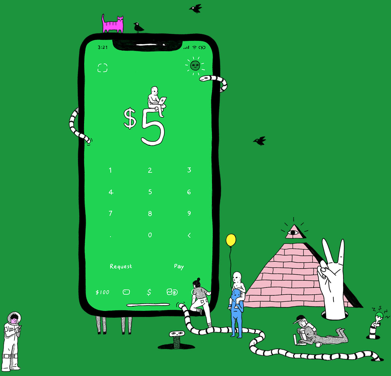
Cash App’s ambitions increased dramatically from its original roots of peer to peer money transfers. We slowly added in new features like the Cash Card, stocks, bitcoin and much more. A complete redesign was needed to accommodate everything.


I joined just as these features were getting added. As the sole motion designer, I helped visualize new flows and created a motion system to help customers navigate this increasing complexity.

Illustration Animations


I saw a big opportunity to bring our illustrations to life. This was our bridge between the clean UI style of the app, and our expressive and weird marketing style. Animation allowed us to inject the crazy brand style while resolving on simpler, informative illustrations when needed.


I utilized Lottie and JSON to deliver the animations. The light weight vector based animations play on iOS, Android, and web. 

Motion System


A motion system was created from the ground up for our ‘3.0’ release. I designed each of the transitions and systematized the timing and curves used. Everything was outlined in the doc, explaining what they meant and when to use them. 


The document was also a source of truth for engineering and contained everything needed for implementation. 

Cash Card


I worked with our visual designer for Cash Card to create an early vision for the card studio. I went all out with parallax effects, 3D cards, and a seamless signup flow. 


Instead of trying to sell this idea with static screens, we showed it brought it to life. Engineers who were initially hesitant got excited and devoted time to implement a 3D engine. We ended up launching the feature close to this original proposal.

Boost UI


To round out the banking features I built a modal system to add rewards, or Boosts, to a user’s cash card. It utalized an interactive carousel to select and add boosts with a tap or a flick. 

Keypad Interactions


I spent a lot of time fine tuning the home keypad. This was Cash App’s instantly recognizable screen and it had to feel slick. I went though a lot of different options for keypad buttons, number input, error states, and even how the thousands comma appears. Figuring out every edge case made implementation very quick.  

Multi-currency


When working on projects I’ll create many different versions – from simple tap based systems, to all out gestural navigation transitions. These are some explorations I created to multi currency support in Cash App. 

Support Lightbox


While some of the work shown above is on the flashy side, a lot of what I do is more in the weeds. I simply figure out micro interactions and just make sure everything works. Motion in itself is usually not the focus. 


I’ll usually work along side a visual designer, break apart designs, to go back and forth to find a solution to a problem. 


This process always reveals edge cases and helps us narrow in on a solution. For instance, I worked with a designer to create a photo Lightbox for our support chat. While the initial idea was simple, I create a dozen different approaches. Some took into account possible technical constraints, others visual tweaks.


Most of our customer’s attachments were screenshots and I found the baked in UI frequently clashed with the Lightbox UI. The proposed solution expanded the photo within a smaller frame to avoid this. 


This back and forth between static and motion can lead to simple, elegant solutions.