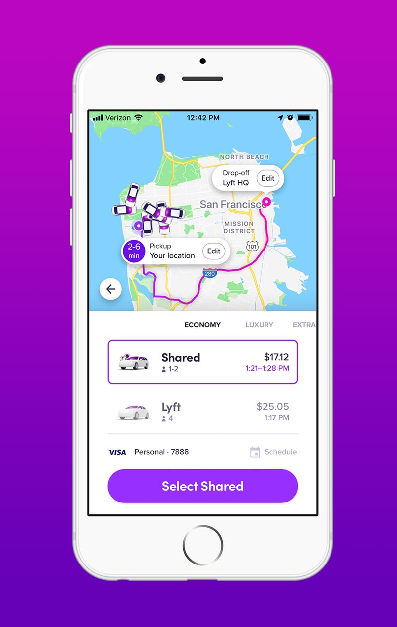
After years of adding tons of new features in an older interface, Lyft needed a new design that was flexible enough to accommodate new functionality. The result is a fresh look that lets users easily find features and request a car in less taps. The new app won the 2018 Google Material Design Award.


During the redesign process I animated user flows and features to quickly find what worked, and what didn’t. Being able to visualize an idea so early on was invaluable to the design process.


I also worked on defining the new motion language for Lyft. This system was documented and made it so future transitions, UI elements, and features are unified.

After years of adding tons of new features in an older design, Lyft needed a fresh new design that was flexible enough to accommodate new functionality. The result is a fresh design that lets users easily find features and request a car in less taps.


During the redesign process I animated user flows and features to quickly find what worked. Being able to see a walkthrough of an idea so early on was invaluable to the design process.


I also worked on defining the new motion language for Lyft. This system was documented and made it so future transitions, UI elements, and features are unified.

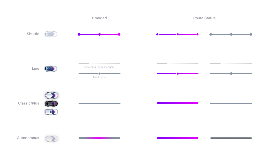
Line Styles


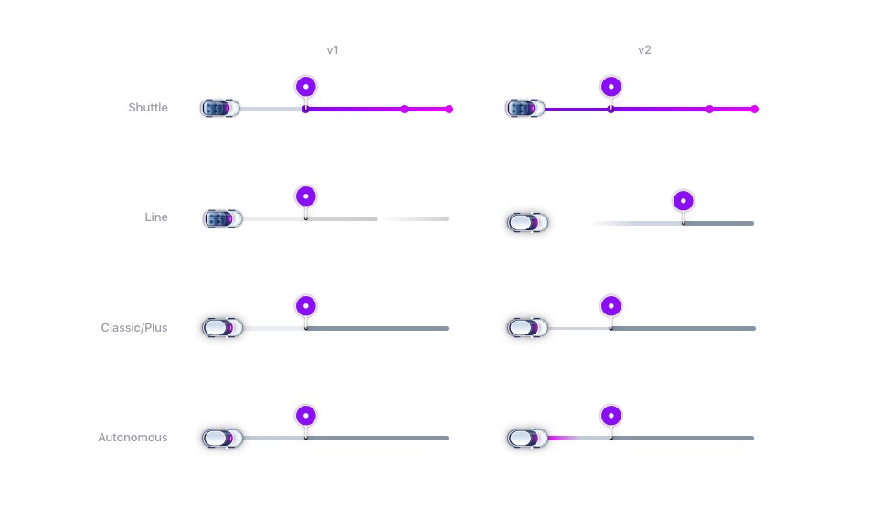
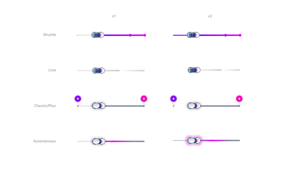
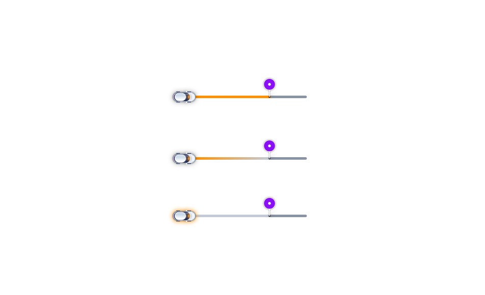
This study explored ways to communicate the chosen ride type using the route line design. I explored many different options to display ride type, arriving and departing status, and information on other riders. I also explored ways of incorporating the amp pickup color.

Lyft Route Overview Design

Route Design Styles

Arriving Route Design

Lyft In route

In Ride Route Design

Arriving with Amp Color

Line Animations


Communicating a shared route was previously displayed as a direct arched line, looking more like a helicopter route. While this communicated a rider’s exact route was unknown, it felt like a faster route when viewed next to a regular direct route. I wanted to figure out a way to communicate the route could change, and the possibility that other riders could join, resulting in a longer route.

Traffic


Lyft riders frequently complained about long pickup and ride times. Most of this was due to traffic, which is out of Lyft’s control. I explored ways to introduce traffic conditions into the app. The options could be displayed automatically, or as a slightly hidden feature by pressing down on the route itself.

Traffic


Lyft riders frequently complained about long pickup and ride times. Most of this was due to traffic, which is out of Lyft’s control. I explored ways to introduce traffic conditions into the app. The options could be displayed automatically, or as a slightly hidden feature by holding down on the route itself.

UI Elements


I explored many ways to bring the elements of the new interface to life. These subtle animations were crucial in adding character to the simple clean design.

UI Logic


The way elements and pages are introduced inform the user a lot about the logic of the interface. I created a system for panel and notification movement to keep the new app consistent and informative.


Every animation uses a consistent style and motion curves. This system was later documented and handed off to developers.

Overlays and Popups


Card and full screen notifications slide up from the bottom of the screen and dismiss in the reverse direction. This in and out motion return the card to its origin, indicating nothing has changed. If an option is accepted, the card scales back into the screen, subtly signaling an alteration has been made.

Menu


The main menu reveals itself in a similar direction to the overlays. When drilling further into the menu, a quick left to right crossfade is used. This gives a refined airy feeling as opposed to reverting to the standard page transition.

Promotions


One way Lyft added a touch of whimsy to its previous app was the promotional car illustrations. Users would find the cars on their map changed to pumpkins or zombies during Halloween, or their local sports team colors during events.


One goal during the redesign was to fix some of the chaos that came from local vendors creating odd car illustrations, and keep the Lyft cars on brand. This left a void for promotions so I explored many different areas to reintroduce this feature. I found the matching screen was the perfect fit for this, since users were waiting on this screen anyway.

Quick Actions


The new redesign let users call a car in as little as three taps, but could we do better? I explored ways to let users call a car to their favorite destinations with just a swipe and confirmation tap.

App Loading


Many different factors can lead to a bad app launch experience, like slow data connection, car density, and GPS load time. I explored ways to smartly orchestrate the app launch to create a great experience and hide latency, no matter how long it took.