Hey Siri
Introducing the next visual evolution of Siri. A responsive waveform with bright colors is now here to assist you.

Introducing the next visual evolution of Siri. A responsive waveform with bright colors is now here to assist you.

Introducing the next visual evolution of Siri. A responsive waveform with bright colors is now here to assist you.
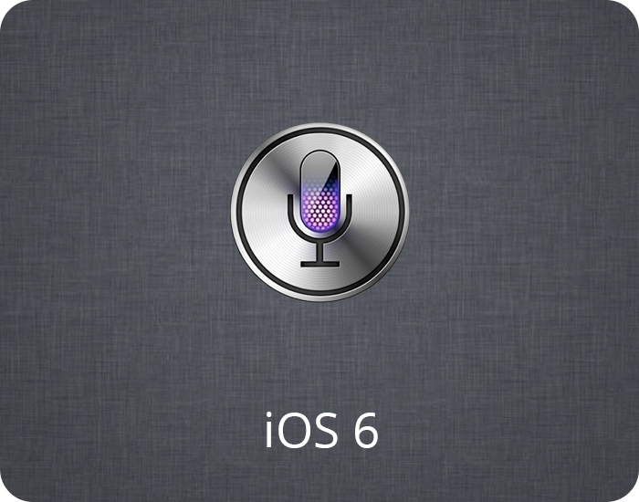
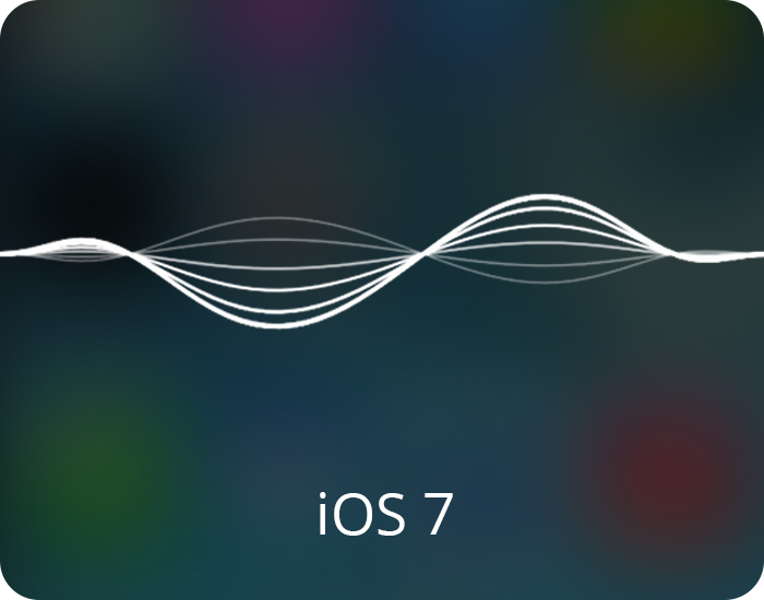
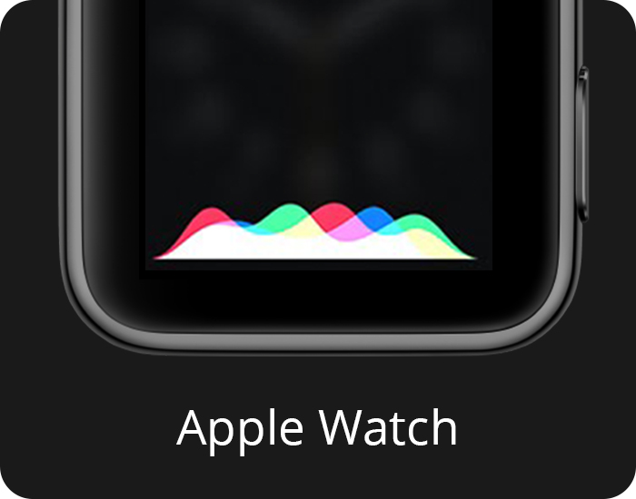
The new identity I created was built on on Siri’s past. I combined the responsive sound waves from iOS 7 with the bright primary colors from the watch to create something new, yet familiar. This form was Siri’s visual identity from 2015-2020. I’m listed on Apple’s patent.


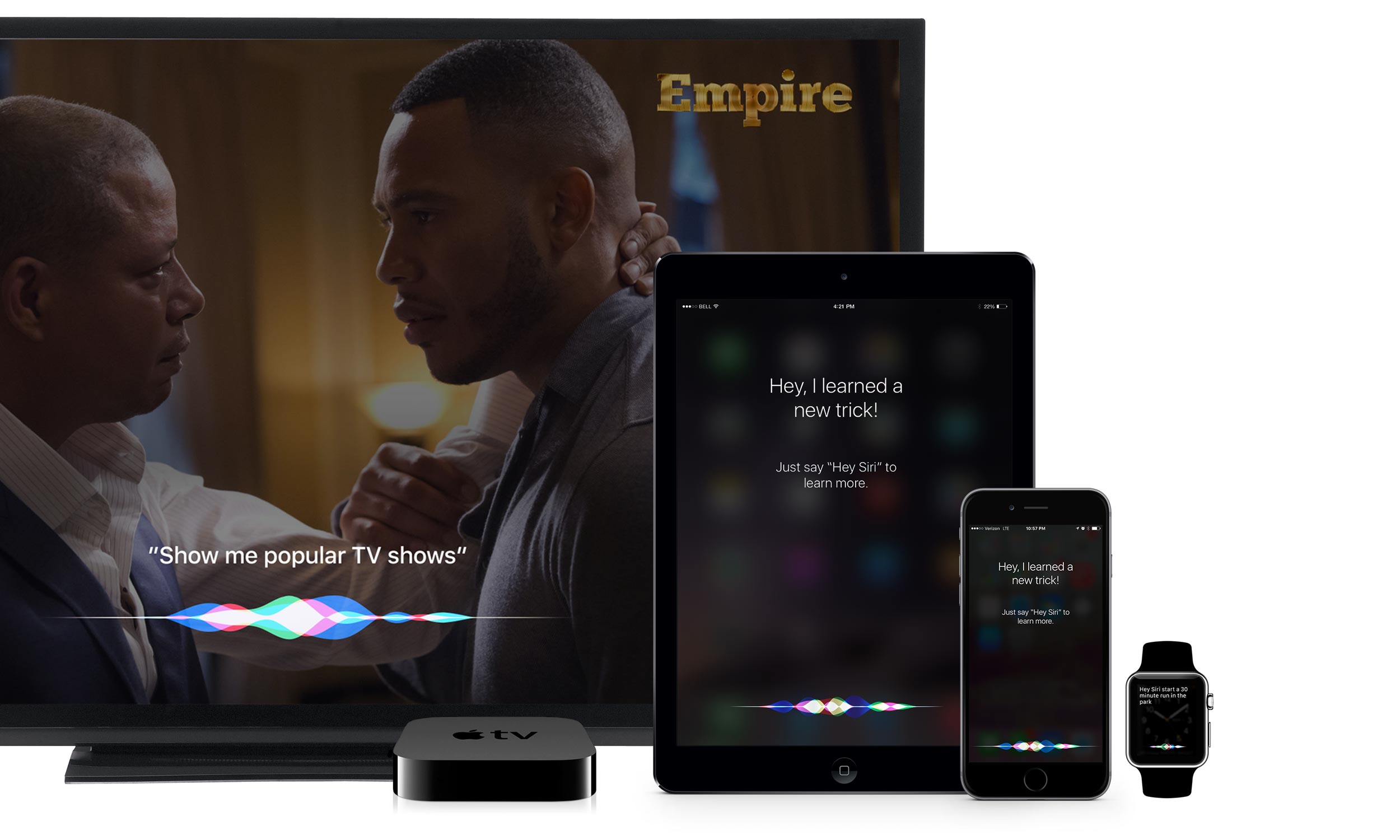
After exploring different designs and forms, like etherial smoke, particles, circular self contained forms, and much more, I pretty quickly moved toward a mirrored waveform. This ensures it can fit on any device, even within the title safe area for TVs. Scale was also a consideration as the design had to look great on everything from a large 50 inch tv, down to the tiny Apple Watch screen.
From there I experimented with many different looks, like changing the colors and wave form based on the users voice frequency for a more personalized look. Various color combinations, overlay modes, and background blurring were also explored to narrow down the branding of Siri.
I then worked with a coworker who prototyped the design in a live programming environment. We locked in the sine-wave style, responsiveness, and more to deliver the final look to engineering.
Siri now has a consistent look across all of Apple’s devices, and looks great on any screen, large or small.
