Xapo is a new breed of banking – bitcoins, no fees, and an ingenious solution for using digital currency with a real plastic card. They are bringing digital currency into the real world. To show they mean business, a beautiful mobile app was needed. After their designers laid out the visual design, I came on to bring them to life.

Bitcoin Graph
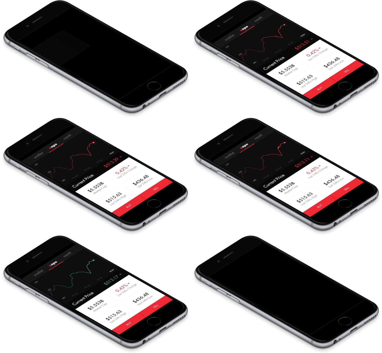
When you first launch the Xapo app, you are presented with a realtime chart of the Bitcoin price. Although we could get the new bitcoin price very quickly, we opted to update the animation every two seconds. Updating it longer than that and it seemed unresponsive. Any quicker and it felt too erratic. This money is essentially in a checking account directly tied to your Xapo card, we don’t want it to feel like your balance is fluctuating rapidly.
Xapo Wallet
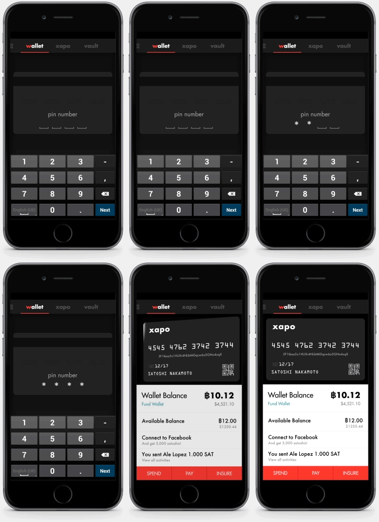
The flagship feature of Xapo is the Wallet. This is where users can access their bitcoins and tie them to their physical card.
I had some fun with the PIN entry and morphed the blank spaces into asterisks. Once the right PIN is entered, a subtle ‘nod’ animation reinforces the user’s actions. Then the card flips around to reveal all their personal data. Since this represents a physical card I decided to give the card a physical look to strengthen that link.
Vault
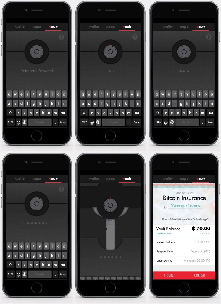
The vault is the secure bitcoin storage and insurance. The transition needs to reflect that secure feeling.
I put the insurance card behind multiple layers and gave all the pieces a back and forth ‘unlocking’ animation. Now the Xapo insurance is securely behind the vault.
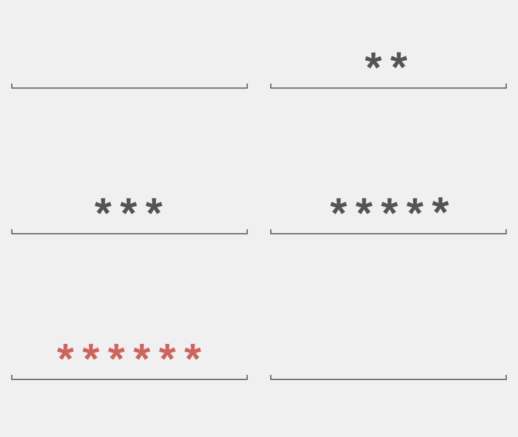
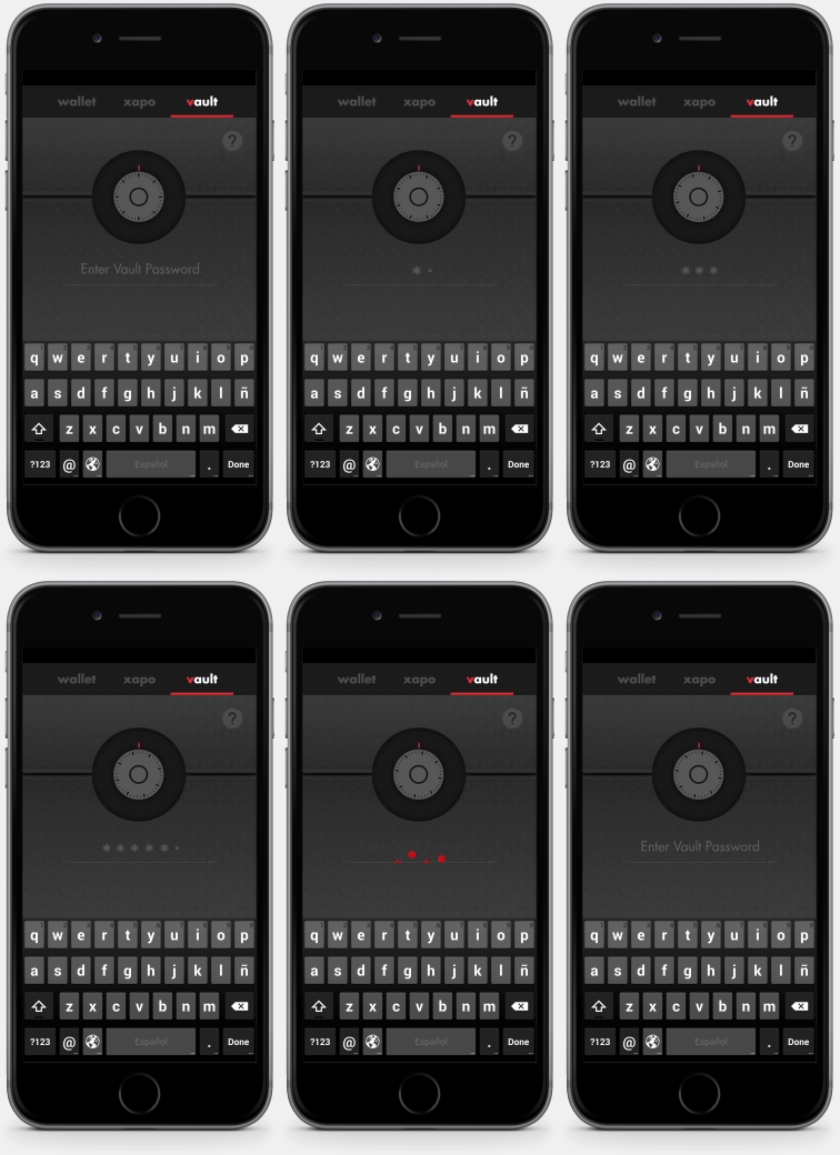
On most apps, password entry is boring, this is the perfect time to surprise the user with some delightful and informative animations.

